Logo
We all care about design.
Clean, fresh and trendy.
Clean, fresh and trendy.
Creativity performed by the combination of rational, creative and crazy team. Non stop studies about the latest design trends and work with professional software lead us to provide you the best creative output.
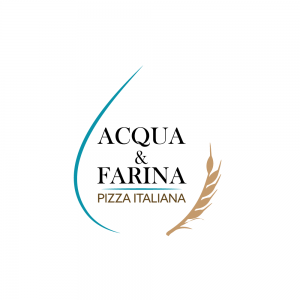
Acqua & Farina
Acqua and Farina in italian means water and flour. These are the main ingredients for making the pizza dough. The logo represents both of these ingredients. On the left with acqua blue part of the waterdrop, on the right a sandy brown wheat. In the middle is the name of the company with classical serif font separating from the descriptive Sans Serif font. Same as their main product - pizza, the company is based on basic rules of quality and taste comming from simplicty.


